May 31, 2006
Earth Day Ducks
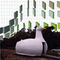
 Information Aesthetics points to some Earth Day infographics in Seed Magazine on the state of the world. I like Seed in general, but here it has been seduced by the green side of the force into misleading.
Despite a lot of design style and fun ideas, it isn't very good data display. I have no doubt Edward Tufte already has blogged about it, but the data ink vs ink ratio isn't very high. We do not need drop shadows to understand, usually.
[Actually, drop shadows do help understanding one thing: the height of something above a surface. We get that information very intuitively, so if an icon is floating and the floating distance tells us something, the shadow has merit. ]
The Hurricane data almost looks like a duck from one of Tufte's books. It makes it hard to see the important ratio or compare regions by not aligning, suggests a perspective that actually lessens the difference between the two overdecorated bar graphs and in lieu of good design just tells the favored conclusion in the title without allowing the viewer to actually check it. Another offender against comparision is the lego block like graph of pollution where it is impossible to actually see the change between different pollutants - a simple bar graph would have done the job instantly. And the uncertainty over whether it is linear dimension, area or volume that represents magnitude recurs again and again. The water availability graph confuses both by this uncertaintly and by not having an obviously undrinkable waterdrop (say dirt brown rather than pale chickenpox - when did you last see that kind of water? Maybe it is actually polka-mint tasting water?).
Several graphs are downright misleading. The "Grass is Greener" uses a pie diagram area to depict urban vs rural population. The immediate impression from the image and the text is that the US is 79% covered by city. The graph really shows that a lot more people live in urban areas now, not their environmental impact.
Also, taking environmental data straight from Greenpeace ought to be as obviously stupid as getting it from Exxon. Even with the best data available these graphs would tend to mislead or confuse but if the data can also be suspected of being biased, there is precious little left to believe here.
Many of the graphs are based on long extrapolations, often apparently used more for impact than real information. The worst offender is the 3d bar dagram at the bottom of "Heat the Poor", which shows a steady increase of sea levels - but the last two bars represent a level of ????? being reached in ????? (!). Even doing a linear extrapolation would have been more informative. Here the designer got away with using made up data that cannot even be criticised, since someday it might become true.
The meaning of the extrapolations are also biased. Bad, Worse, Worst uses its title to make sure that it is interpreted in the worst possible way. But a rise in CO2 is just that, it is its consequences are what really counts.
Shouting harder is not a good kind of argument. Two graphs use the "huge fontsize number" to tell us about extinction rate and water usage. Important numbers, but just put there without context and intended to raise emotions but not inform. I'm reminded of the acceptance letter Tufte blogged about which actually got this trick right - it gave salient information and even an emotional boost - but these doesn't tell us much relevant. Especially the extinction risk number is just scare, since it is the number of species that might go extinct, but to see the underlying assumptions, distribution and other information making the number relevant you have to go to the original article.
I don't know if the cause of this is an earnest desire to help planet Earth by any means (including misleading and exaggerating) or just a designer with more concern for cool graphics than the importance of what he is trying to show. My guess is the latter, since many of the errors actually weakens the case. I guess it is better holiday imagery than pumpkins or santas, but it does not actually manage to inform.
May 24, 2006
A Picture of Health
 Some recent CNE Health blog entries:
Make a Clean Breast of It. On the recent HFEA decision to allow PGD for BRCA1/2 cancer, another step towards UK bioliberalism. Of course, the House of Lords decision against a right-to-die bill shows that all is not rosy.
Evidence Based Health Policy Against Fads. Inspired by a fun paper modelling management fads.
Publish or Perish, on the publication of survival rates of heart surgery for different hospitals and doctors.
Profiting from the War on Cancer , on how much society would profit from reductions in cancer. A lot, of course. In general the value of better health is enormous, but we are not very good at figuring out how to get it.
Tag Along
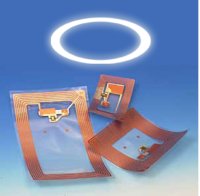
 Yesterday I presented my report on RFID tags, "Den Hänsynsfulla Taggen" (in Swedish) at a seminar hosted by Hitachi where I discussed with Pär Ström and the audience how to get the benefits from the technology without losing privacy.
The report describes RFID technology and some possible applications, ranging from the obvious (replacement/substitute for product marking) over the unusual (marking holy cows to prevent people from being paid return fees twice) and playful (sending files using nerf darts) to the futuristic (a world where everything is identifiable).
In general RFID is just one kind of identity technology: methods of maing objects "know" who, what and whose they are, and allowing automated systems to make use of this information. It could just as well be done using traditional EAN codes, QR codes, pattern recognition, laser fingerprints, biometrics and other systems. Identity technology is IMHO just as transformative as information technology, biotechnology, nanotechnology and artificial intelligence. It is a general technology that can be applied to nearly anything, combined with other technologies and likely to spawn many new and currently unthinkable applications.
The big problem is of course that many are up in arms about the integrity risks. Leaving out total paranoia, it is clear that enabling reliable and discreet tracking of things and people poses problems. Pär was mostly concerned with people tracking, but even our possessions contain parts of our extended selves. I proposed a number of remedies to get the best out of the situation:
- Constructing trust, both by designing trustworthy systems and by engaging stakeholders of all kinds in the development process. Some problems can be solved by engineering, like security, blockable tags or how to handle the data. But much is going to be social interactions: do we trust the different stakeholders and their methods and goals?
- A focus on end user benefits. Consumers have nothing against GMO in Europe if they see a lower price or higher nutrient count; consumers would love RFID tags if they visibly lowered prices or gave their goods useful capabilities.
- Develop visible and transparent technology. It should not be secretive, and its activity should be possible to monitor. Tags should have clear owners and defined loyalties. Maybe we should make markup describing the tag system a standard feature, so that people can if they wish check out unfamiliar aspects of an objects identity.
- Give the user a sense of control over it. This includes the ability to turn off, remove or shield tags, but also the ability to read tags in the vicinicty and to write to owned tags.
- Getting people to discuss the values and visions they have for their technology. Just explaining why tags are used makes people much more comfortable with them, and admitting the dreams driving much development enables more broad and deep discussions about means and ends.
- Enable experimentation with the technology. There is a big risk that industry and critics just think of the big applications like supply chains, producing regulations that are based on these assumptions. But general technologies are innovation friendly. To get the maximum benefit we should have a broad base of bottom upp experimentation, ranging from RFID hackers to kids to entrepreneurs, and the understanding that we will see many utterly unexpected uses. Regulations ought to not gel too fast, since they might otherwise trap the technology based on the assumptions of an early stage.
- Pär wanted a constitutional right for anonymity, I proposed the heuristic that any expansion of the surveillance rights of organisations must be met by a corresponding expansion of public oversight.
May 14, 2006
Best Do it So!
 Here are my thoughts on the closing of Extropy institute.
I don't think we should feel sad about ending an institution. As human lifespans extend and society becomes more changing we will outlast more and more of our institutions. Most companies have a lifespan of 5-10 years, and a huge number of people live in nations that did not exist when they were born. That we will outgrow our organisations seems natural and a good sign - the reverse would be worrying (although of course there are long now organisations that are good too).
This is especially true when an organisation packs itself together and does a graceful shutdown. Times have changed, and the approach need to be changed. No irrational implosions or dissolutions, just the realisation that the kind of organisation that did much good at the start of the 90's might not be useful in the 00's.
I became a transhumanist after reading Wired's "Meet the Extropians" article. Sure, I had these ideas long before, but this was the first time I found a reference to a group of likeminded people. Thanks to the net, it was the start of my participation in the transhumanist community. The article also spurred a group of my friends to start first the mailinglist Omega (still going strong) and the Swedish transhumanist association (also closed).
As I see it, the first generation of transhumanist organisations were based on the implicit idea that their ideas were rare in society and there was a need for an internal forum to gather the interested, discuss them and work at making them slightly less foreign to the mainstream. This made them typical informal volunteer organisations, perfect for small movements (especially early net adopters) but highly dependent on individuals and somewhat unable to move outside the own core group. As transhumanism as an idea spread and became more recognized (if not accepted then at least regarded as a position in the debate), this kind of organisation can't keep up. There is a need for a formal structure, methods of media contacts and ways to link to other organisations and issues of importance. Many of the leading individuals also got truly started with time consuming but important careers and projects, leaving the informal organisations rather leaderless. This is how the second generation of transhumanist organisations emerged, with much stronger formal structure and less dependent on the unpaid volunteer/ambitious person approach. It is hard to turn an informal organisation, especially a settled one, into a formal one. Too many people have found their own odd memetic niches and attempts to streamline things will mean conflicts and quite likely the destruction of the useful network that makes up the organisation.
This is also why ExI is not really dead. The network of people in and around it is intact and still in communication. From this network it is possible to bootstrap new organisations that make sense in the present and near future. In fact, the closing is a good signal to get people to start building; sometimes there is too much a reliance on that old institutions ought to do things rather than that new institutions could do them. Some of the new will fail for their own reasons, some will succeed. But in the end they are just tools for ideas and people with vision. Even the best tool become worn or obsolete one day, and then it is time to replace it.
May 09, 2006
A Passion for Deduction
 Many webcomics are fun, or tell great stories or contain good art. But how many deals with the issues of reverse look-up of 70's library records, how to calculate remaining oxygen using a watch and an origami cube or to deduce destinations of bus passengers?
Shigabooks, the comics by jason Shiga, contain all that. If there is one unifying theme it is a love for deduction, to take the minutiae of everyday life and find the underlying secret order.
My absolute favorite is "Fleep", a ruthlessly logical story about survival in a phonebox encased in concrete. There is surprisingly much to be done and discovered within the confined space (with 2 ballpoint pens, 20 ft of dental floss, a digital wrist watch, a Russian paperback, 3 coins and a handwritten note).
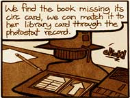
"Bookhunter" deals with the library police hunting down book stealers, a mixture of Dragnet and CSI set in a world of index cards and glue qualities. It has a wonderful 70's library feel of brown and thick paper. "Meanwhile" is a McCloudesque experiment, part nonlinear narrative, part puzzle.
I feel a strong resonance with this appreciation of the minutiae of the world. Every object can be examined and give clues, or turned into a tool of investigation. With a well-stocked mind one is never helpless... unless it involves using game theory to decide whether to watch movies.