January 24, 2007
They Rule...?
 THEY RULE is one of the best information visualisation apps around. It is interactive, has an easy interface, looks good and enables sharing of findings. It also has a strong message, and that may be its problem: it promotes the image of a vast ruling class conspiracy where everybody networks with everybody in the name of profit and power. The problem with this is that the data used does not support it; it is an assumption added by the context.
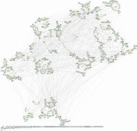
I took the liberty to plot the database as a graph, with nodes corresponding to board members, companies and institutions.
The network is essentially a social network with some pecularities. Boards have a distribution centered around 11 members, while individuals appear to follow a power law (but since the maximum number of boards anybody participates in is 8, this is pretty uncertain).
It clearly has small world properties, and this is what makes THEY RULE so convincing: choose any two corporations and there will be a very short chain between them. But this is not because they are a strongly cohesive group. It is just the effect of a few bridge-builders.
Looking at betweenness centrality picks out the most important connectors (in order of centrality): the Brookings Institution, the Council of Foreign Relations, the University of Pennsylvania, Dr. Judith Rodin and Washington University in St. Louis. After these most central we get a second rank consisting of 3M, the Clinton administration, Shirley Ann Jackson and Kenneth Duberstein. In the third rank we get Proctor & Gamble, MIT, Caltech, Sara Lee, Amgen and Warren Rudman. It is interesting to note the dominance of non-corporate institutions as well as the number of women. If we were to leave out the non-corporate institutions the main cluster becomes less cohesive (it still holds together, though; 3M, Sara Lee and Procter & Gable are now most central).
I think that if we took a similar number of social clubs (the bowling gang, the pub regulars, roleplaying groups etc) and did a similar plot we would find it to be largely similar to this. The only difference is that nobody would seriously view it as a conspiracy. This network depicts people and organisations that do have significant influence, but it does not show the real influence. This is the formal social network of shared membership but it does not show the actual network of information flows, shared (and opposite) goals and informal social interactions. There are plenty of golf clubs, fraternal orders and mutual friends that are more important for that, but they are of course far harder to find. If there is a significant information flow in the overt network it would seem to promote university and think tank boards as key places. But any real plotting will not occur where there are secretaries and transcribers. I think there is a risk that we may stare ourselves blind at formal networks when everybody on this graph is merely a phonecall away from everybody else.
Still, it is nice to see the connections. It might be more enlightening looking at more overtly ideological groups like think tanks, political committees, NGOs etc. Imagine doing this with say http://activistcash.com/ and http://www.sourcewatch.org (ideally both). Hopefully that would dispell the claim that "X is a front for Y" somehow invalidates X's opinions - because if it did, practically nobody would have valid, "pure" opinions. We are all bought and influenced by each other.
Posted by Anders3 at January 24, 2007 02:13 AM