February 02, 2007
Shredding the Shreddies
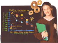
 Carl / home away from home is shredding a piece of infographics on Nestle Cheerios (found via information aesthetics). Being a trainee crotchety old infovis/cognitive enhancement git myself, I can't resist weighing in.
If we leave out the amazingly bad graphics, there is still the data. First, there is apparently no attribution of where it came from, except that it was done by CDR and Reading Scientific Services. No paper citation, no link. Is that too much to ask for? While a scientific paper may still scare away people, these days nobody will run screaming away from the breakfast table when encountering an URL. To my mind any unreferenced claims like this should be regarded as "we made it up".
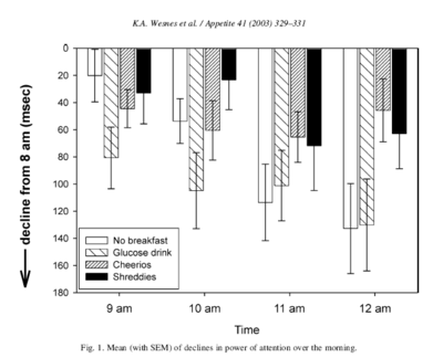
But being an obsessive info-hoarder I actually recognized the data! It comes from Wesnes KA, Pincock C, Richardson D, Helm G, Hails S. Breakfast reduces declines in attention and memory over the morning in schoolchildren. Appetite. 2003 Dec;41(3):329-31. Not made up and a peer reviewed journal, but funding bias might of course be a problem.
Here is the diagram from the original paper:
It is not a very good graphical design. Points for showing the decline of attention as going downwards rather than some inverted scale, as well as showing the error bars. But since it is supposed to show a time course the bars make it very hard to see what is happening except that the last two bars tend to stay high.
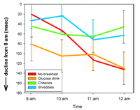
This is how I would have done it. Maybe the colors should not have been used out of concern of color-blind readers (and Appetite is in black and white I think), but I find reading different markers and dashes cognitively effortful. Error bars are cruicial but hard to do when they overlap - but it is the overlaps that matter, since they tell us when there is a chance of statistical significance.
Carl says:
"First of all, every condition shows a decline in concentration overall - with 8am as the benchmark! I can't concentrate on walking at 8am! Downhill from that is comatose!!"Being a late riser I can only agree. Maybe the 12-year olds were excited by going to a real lab for testing? But given the amount of boring tests they quickly began to lose interests. How would you feel after doing Word presentation, Immediate Word Recall, Picture Presentation, Simple Reaction Time, Digit Vigilance, Choice Reaction Time, Spatial Working Memory, Numeric Working Memory, Delayed Word Recall, Word Recognition and Picture Recognition as well as 16 bipolar ratings of mood and alertness - four times each day, for four days? So the graph shows the decline from "hard to walk" to comatose and beyond.
Carl:
"If a glucose drink is the only competition then Cheerios can't be doing too well against anything more sensible."The zero baseline apparently corresponds to a normal breakfast. So apparently a normal breakfast is not much better than Cheerios (or no breakfast, at least at 9 am!) Perhaps most normal breakfasts are a bowl of Cheerios and something else like a glass of orange juice. In general various studies have found that glucose does improve cognition so the discrepancy in this study is a bit odd.
My conclusion is that the graph is not pseudoscience or just advertising. It might be somewhat weak research (29 participants, but at least they were gender balanced and the test was apparently a standard test) and there is the nagging doubt that maybe the funding source (Cereal Partners UK) might have biased it, but it is not nonsense. Not even when the advertising people redrew the graph did it loose all information - for once there was a vertical scale and they even stated a unit, but they forgot to tell what it actually measured. And they added a zero point, which is absent in the paper graph and not a bad idea. Compared to much stuff out there this was a masterpiece of scientific communication.
Rereading this post I realize that I have completely failed at being crotchety enough. Hmm, I better start looking for graphs on my cereal boxes.
Posted by Anders3 at February 2, 2007 02:37 AM
