March 23, 2010
The food is growing on the plates
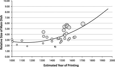
Here is a fun use of image processing: checking trends in how portion sizes in depictions of the last supper have changed. International Journal of Obesity - The largest Last Supper: depictions of food portions and plate size increased over the millennium (Wansink & Wansink, doi: 10.1038/ijo.2010.37). The authors note that the relative sizes of the main dish, the bread and plates has increased over the last millennium. They think this relates to an increased salience of food in culture.
In general, estimates of portion sizes tends to be larger in hungry individuals. However, we may over or underestimate portion sizes differently for different food. Hence, there could be a lot of things going on here - different "normal" portion sizes for the painter and audience, different kinds of food, different hunter levels, different ideas of what constitutes a meal and even different views of which point in the last supper is worth depicting.
The authors claim a linear increase in portion sizes, but in their figure they have fitted a concave curve. Maybe they have found a new exponential to add to Kurzweil's quiver of curves: as we approach the singularity we will be more and more food-obsessed? :-)
