Where to hide? Likely with your neighbors

If you are into civilization-scale prepping, this paper is a must read: Jehn, Florian Ulrich, Maximilian Rössler, Luke Kemp, Mike Cassidy, Zachary Kallenborn, Juan Bartolomé García Martínez, Lara Mani, and Matt Boyd. “No place to hide? Regional resilience and vulnerability to global catastrophic risk.” Global Challenges. 10:8 (2026).

The key point is that there is no best place to be in a global disaster: some are better in some circumstances, but none are good against all GCRs.
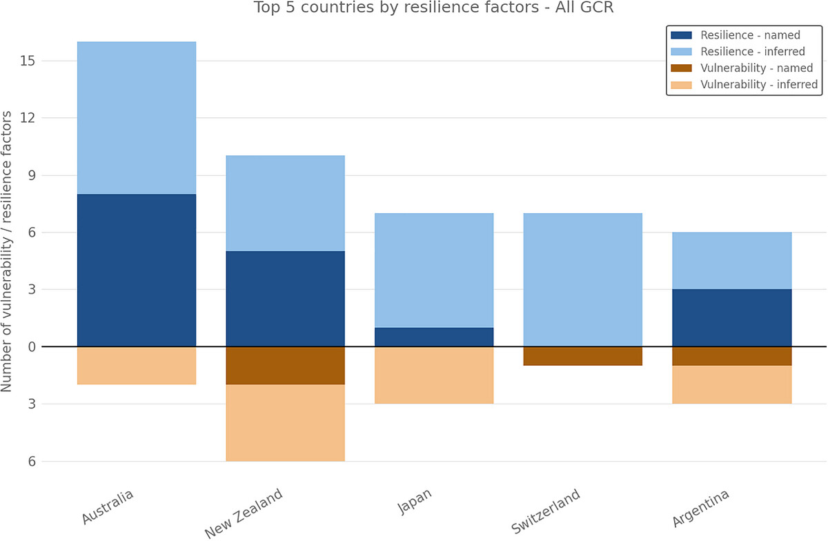

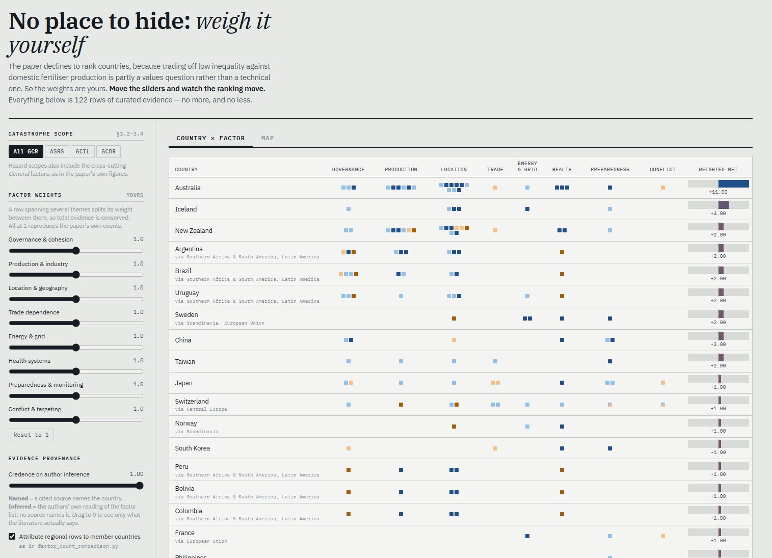
Fig 8 from the paper: Overview of how often countries were mentioned directly as resilient or vulnerable in cited documents or inferred by the authors of this paper based on factors described in other documents.

Factors that add resilience against some things (e.g. being an island) are at odds with other factors (e.g. volcanism, weak access to global supply chains). Geography is hard to change. Hi-tech societies have resources, but are vulnerable to cyberattacks and HEMP.

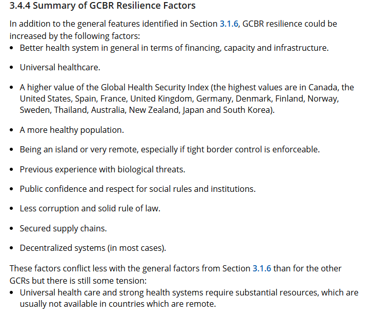
There are however synergistic factors that can be improved: governance quality (democratic institutions, low inequality, state capacity, low corruption, and social cohesion are protective), decentralization, preparedness, food system resilience.
(Yes, one can totally imagine an enlightened authoritarian doing great here by harnessing state capacity… except that there are not many Lee Kuan Yews around – try to find examples beside Singapore that reliably has pulled it off. The base rate is low, so one cannot rely on this in a crisis. Democracies are the reliable low variance approach.)

The caricature prepper planning to outlast the End alone with toilet paper and guns was of course wrong, since disaster survival is very much a community thing. The same applies to GCRs: there is no place that can smugly ignore the rest of the world, we need the global community.

Interactive Interface
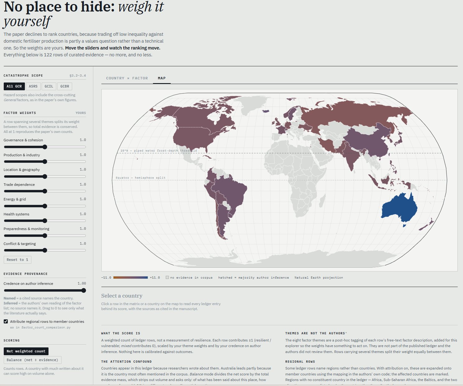
I really liked the paper, but I was curious about the data. So I quickly vibe-coded an interactive interface.

You can find it at https://aleph.se/references/gcr-resilience-explorer.html – this is the Claude one-shot at interpreting the paper and supplementary data (the eight factors are his too). Very useful for getting a feel for what is in there.

You can change the weightings of the factors to change the ranking. The inference credence is how much you buy the author estimates vs the literature estimates. Net weighted count scoring tends to overweigh much-written-about countries like AUS; balanced divides by # of evidence, letting countries like Iceland shine.

I think what I first noticed is how scarce data is! This is not built on massive data. This is built on scattered reports painstakingly collected. There ought to be much, much more – an obvious follow up project would be to scour the open literature for more.

This is why the regional imputation is doing a lot of work. Which makes sense, since many disasters have a geographical nature and hence regions are hit somewhat similarly.

At least in my visualization it looks like Taiwan has no conflict risk, but that is because the marker just indicates nuclear war issues: makes sense in this context, but easy to misinterpret.

Still, I think the paper findings are solid and a bit obvious (in retrospect). What I really think one could do is to use AI to not just build a deeper database, perform clever imputation of missing data, but start mapping the cross-country links and correlations.

Automating the data-gathering may also allow what the paper points out: the situation is dynamic, and one should see it as a snapshot. Indeed, being able to disregard stale reports or extrapolate trends a bit might be valuable.

This is also a bit of a demonstration of a new way of reading papers: do not just ask for an AI summary, ask for an interactive exploration!
Maps of mindspace

Annotations for philosophy mapThe ever awesome Scott Alexander made a map of the rationalist blogosphere (webosphere? infosphere?) that I just saw (hat tip to Waldemar Ingdahl). Besides having plenty of delightful xkcd-style in-jokes, it is also useful by showing me parts of my intellectual neighbourhood I did not know well and might want to follow (want to follow, but probably can’t follow because of time constraints).

He starts out with pointing at some other concept maps like that, both the classic xkcd one and Julia Galef’s map of Bay Area memespace, which was a pleasant surprise to me. The latter explains the causal/influence links between communities in a very clear way.

One can of course quibble endlessly on what is left in or out (I loved the comments about the apparent lack of dragons on the rationalist map), but the two maps also show two different approaches to relatedness. In the rationalist map distance is based on some form of high-dimensional similarity, crunching it down to 2D using an informal version of a Kohonen map. Bodies of water can be used to “cheat” and add discontinuities/tears. In the memespace map the world is a network of causal/influence links, and the overall similarities between linked groups can be slight even when they share core memes. Here the cheating consists of leaving out broad links (Burning Man is mentioned; it would connect many nodes weakly to each other). In both cases what is left out is important, just as the choice of resolution. Good maps show the information the creator wants to show, and communicates it well. 

It is tempting to write endless posts about good mindspace maps and how they work, what they can and cannot show, and various design choices. There are quite a few out there. Some are network layouts made automatically, typically from co-citations. Others are designed by hand. Some are artworks in themselves. I don’t have the time today. But starting the day with two delightful ones that trigger much new thoughts and planning is a good way of starting the day.

Plotting morality

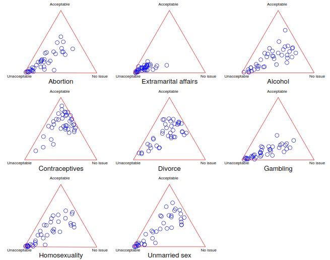
Pew Research has posted their Morality Interactive Topline Results for their spring 2013 and winter 2013-2014 survey of moral views around the world. These are national samples, so for each moral issue the survey gives how many thinks it is morally unacceptable, morally acceptable, not a moral issue or whether it depends on the situation.

Plotting countries by whether issues are morally acceptable, morally unacceptable or morally irrelevant gives the following distributions.

Traingular plot of Pew Morality Survey

Overall, there are many countries that are morally against everything, and a tail pointing towards some balance between acceptable or morally irrelevant.

The situation-dependence scores tended to be low: most people do think there are moral absolutes. The highest situation-dependency scores tended to be in the middle between the morally unacceptable point and the OK side; I suspect there was just a fair bit of confusion going on.

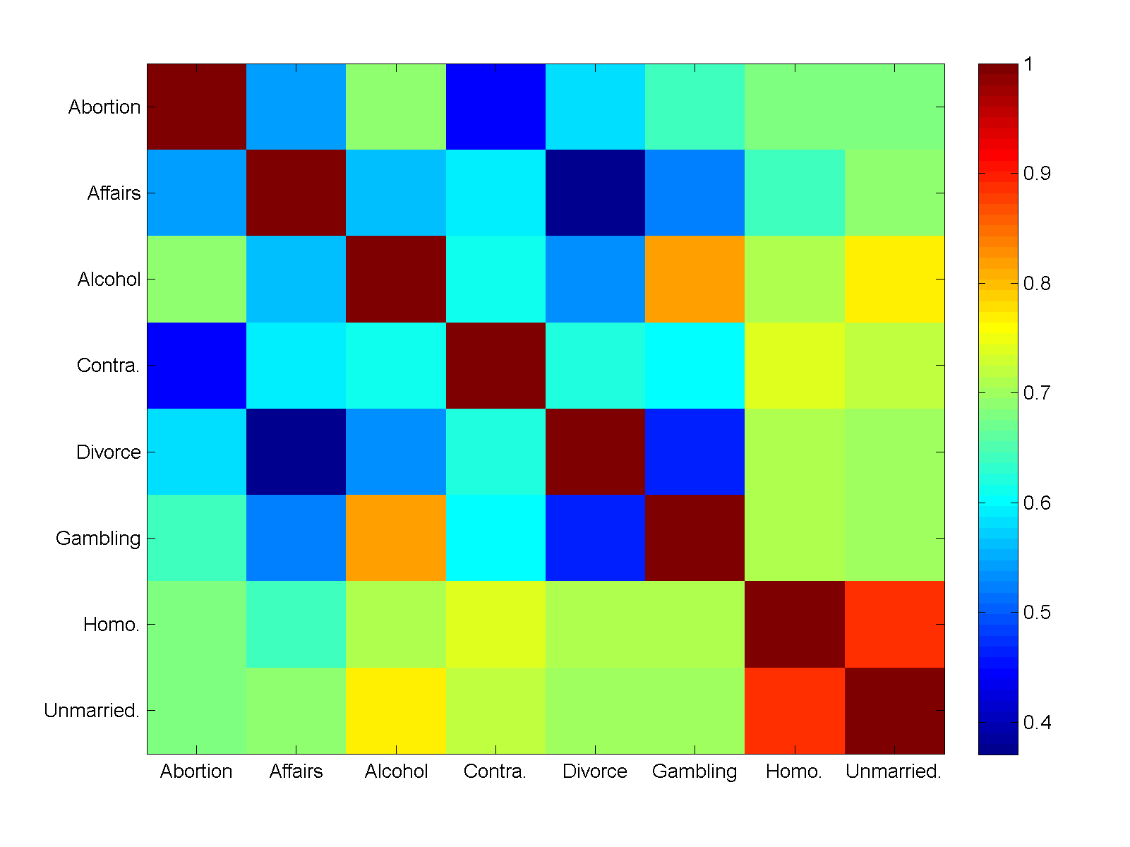
pewcorr

Looking at the correlations between morally unacceptable answers suggested that unmarried sex and homosexuality stands out: views there were firmly correlated but not strongly influenced by views on other things. I regard this as a “sex for fun” factor. However, it should be noted that almost everything is firmly correlated: if a country is against X, it is likely against Y too. Looking at correlations between acceptable or no issue answers did not show any clear picture.

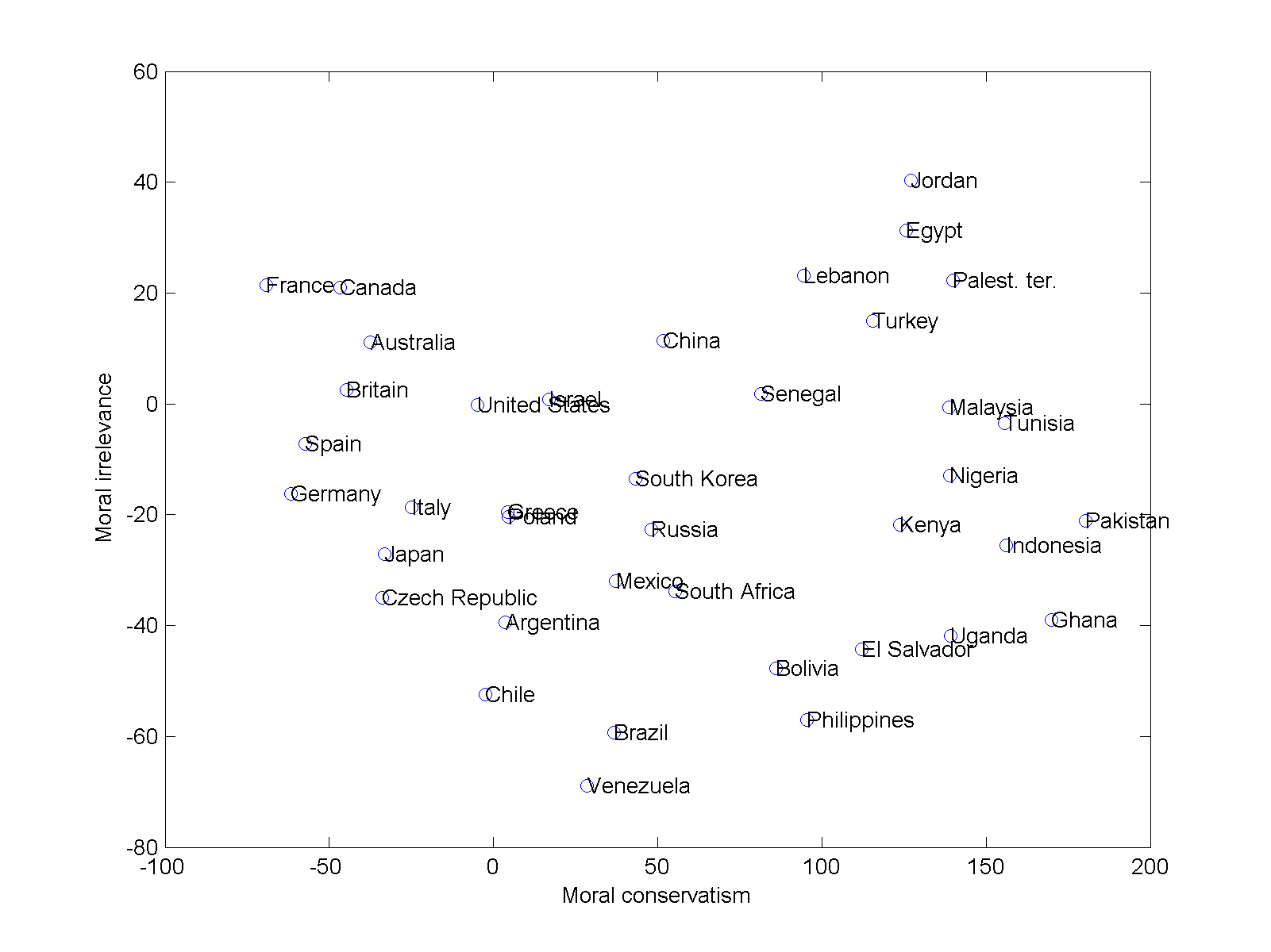
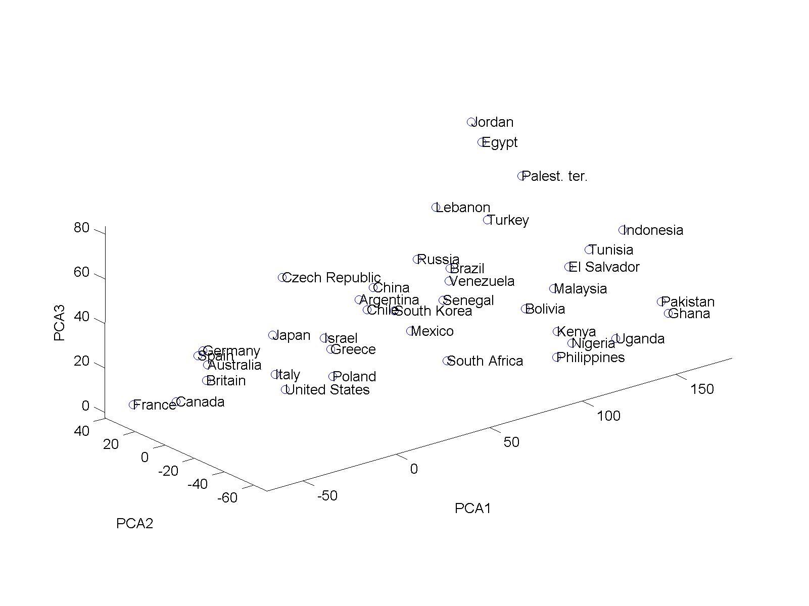
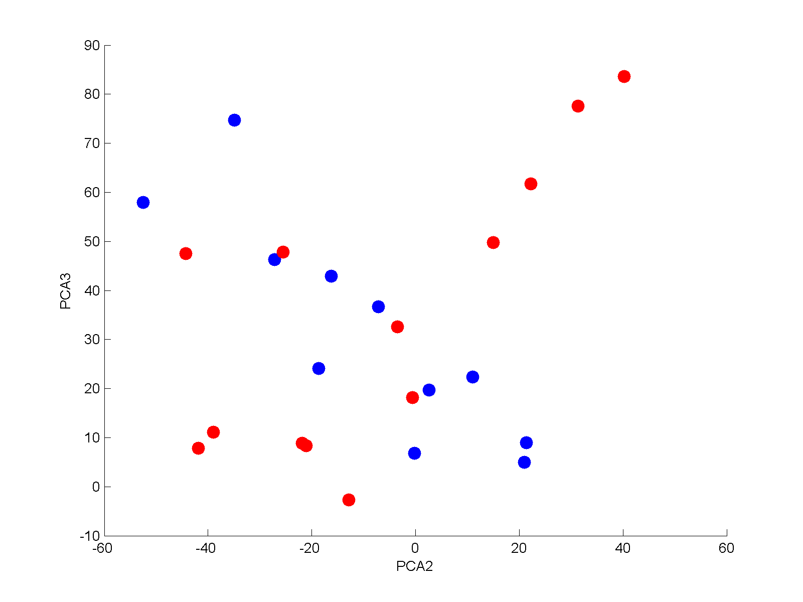
pewpca2d pewpca3d

The real sledgehammer is of course principal component analysis. Running it for the whole data produces a firm conclusion: the key factor is something we could call “moral conservatism”, which explains 73% of the variance. Countries that score high find unmarried sex, homosexuality, alcohol, gambling, abortion and divorce unacceptable.

The second factor, explaining 9%, seems to denote whether things are morally acceptable or simply morally not an issue. However, it has some unexpected interaction with whether unmarried sex is unacceptable. This links to the third factor, explaining 7%, which seems to be linked to views on divorce and contraception. Looking at the 3D plot of the data, it becomes clear that for countries scoring low on the moral conservatism scale (“modern countries”) there is a negative correlation between these two factors, while for conservative countries there is a positive correlation.

Plotting the most conservative (red) and least (blue) countries supports this. The lower blue corner is the typical Western countries (France, Canada, US, Australia) while the upper blue corner is more traditionalist (?) countries (Czech republic, Chile, Spain). The lower red corner has Ghana, Uganda, Pakistan and Nigeria, while the upper red is clearly Arab: Egypt, the Palestinian territories, Jordan.

In the end, I guess the data doesn’t tell us that much truly new. A large part of the world hold traditional conservative moral views. Perhaps the most interesting part is that the things people regard as morally salient or not interacts in a complicated manner with local culture. There are also noticeable differences even within the same cultural sphere: Tunisia has very different views from Egypt on divorce.

For those interested, here is my somewhat messy Matlab code and data to generate these pictures.

The last sunset

Recently encountered the paper The last sunset on mainland Europe by Jorge Mira. No, despite the ominous title and my other interests it is not an estimate of when the ultimate sunset would happen (presumably either when Europe is subducted or when it gets vaporized together with Earth a few billion years hence by the ultimate sunrise). It is more along the lines of XKCD What-If’s “When will the sun finally set on the British Empire?

Mira points out that the terminator is a great circle that changes direction throughout the year, so at different times different parts of Europe will be last. He found that these parts are Cabo de São Vicente (Portugal, Oct 19-Feb 21), Cabo da Roca (Portugal, Feb 21-Mar 24, Sep 20-Oct 19), Cabo Tourinan (Spain, Mar 24-Apr 23, Aug 18-Sep 19), a site near Aglapsvik (Norway, Apri 24-May 1, Aug 11-Aug 18), and a place in Masoy south of Havoysund(Norway, May 1-May 10, Aug 2-Aug 10).  From May 11-Aug 1 the point skips along the coast to the Arctic circle and back. Which technically might mean it moves instantly through Sweden, Finland and Russia too at the summer solstice.

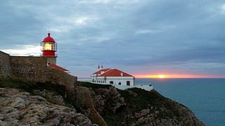
I happened to be taking a sunset photo at Cabo de São Vicente when I was there Dec 27: this was the last mainland sunset for that day.
Last sunset