The Universe Today wrote an article about a paper by me, Toby and Eric about the Fermi Paradox. The preprint can be found on Arxiv (see also our supplements: 1,2,3 and 4). Here is a quick popular overview/FAQ.
TL;DR
- The Fermi question is not a paradox: it just looks like one if one is overconfident in how well we know the Drake equation parameters.
- Our distribution model shows that there is a large probability of little-to-no alien life, even if we use the optimistic estimates of the existing literature (and even more if we use more defensible estimates).
- The Fermi observation makes the most uncertain priors move strongly, reinforcing the rare life guess and an early great filter.
- Getting even a little bit more information can update our belief state a lot!
Contents
- So, do you claim we are alone in the universe?
- What is the paper about?
- Dissolving the Fermi paradox: there is not much tension
- The Great Filter: lack of obvious aliens is not strong evidence for our doom
- Isn’t this armchair astrobiology?
- Probability?
- Correlations?
- You can’t resample guesses from the literature!
- But doesn’t resampling from admittedly overconfident literature constitute “garbage in, garbage out”?
- What did the literature resampling show?
- What are our assumed uncertainties?
- Abiogenesis
- Doesn’t creationists argue stuff like this?
- Complex life
- How much can we rule out aliens?
- So what? What is the use of this?
- Ah, but I already knew this!
So, do you claim we are alone in the universe?
No. We claim we could be alone, and the probability is non-negligible given what we know… even if we are very optimistic about alien intelligence.
What is the paper about?
The Fermi Paradox – or rather the Fermi Question – is “where are the aliens?” The universe is immense and old and intelligent life ought to be able to spread or signal over vast distances, so if it has some modest probability we ought to see some signs of intelligence. Yet we do not. What is going on? The reason it is called a paradox is that is there is a tension between one plausible theory ([lots of sites]x[some probability]=[aliens]) and an observation ([no aliens]).
Dissolving the Fermi paradox: there is not much tension
We argue that people have been accidentally misled to feel there is a problem by being overconfident about the probability.

The problem lies in how we estimate probabilities from a product of uncertain parameters (as the Drake equation above). The typical way people informally do this with the equation is to admit that some guesses are very uncertain, give a “representative value” and end up with some estimated number of alien civilisations in the galaxy – which is admitted to be uncertain, yet there is a single number.
Obviously, some authors have argued for very low probabilities, typically concluding that there is just one civilisation per galaxy (“the 

If one combines either published estimates or ranges compatible with current scientific uncertainty we get a distribution that makes observing an empty sky unsurprising – yet is also compatible with us not being alone.
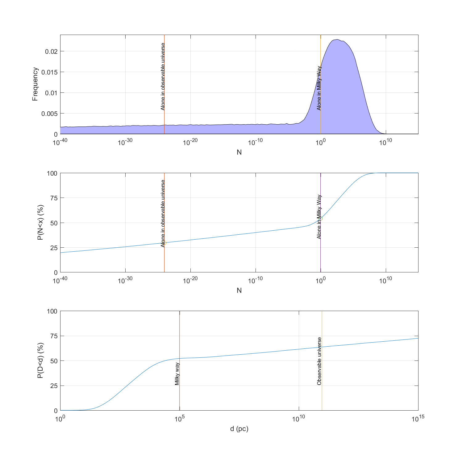
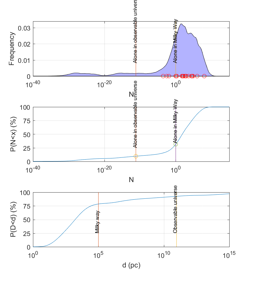
The reason is that even if one takes a pretty optimistic view (the published estimates are after all biased towards SETI optimism since the sceptics do not write as many papers on the topic) it is impossible to rule out a very sparsely inhabited universe, yet the mean value may be a pretty full galaxy. And current scientific uncertainties of the rates of life and intelligence emergence are more than enough to create a long tail of uncertainty that puts a fair credence on extremely low probability – probabilities much smaller than what one normally likes to state in papers. We get a model where there is 30% chance we are alone in the visible universe, 53% chance in the Milky Way… and yet the mean number is 27 million and the median about 1! (see figure below)
This is a statement about knowledge and priors, not a measurement: armchair astrobiology.
The Great Filter: lack of obvious aliens is not strong evidence for our doom
After this result, we look at the Great Filter. We have reason to think at least one term in the Drake equation is small – either one of the early ones indicating how much life or intelligence emerges, or one of the last one that indicate how long technological civilisations survive. The small term is “the Filter”. If the Filter is early, that means we are rare or unique but have a potentially unbounded future. If it is a late term, in our future, we are doomed – just like all the other civilisations whose remains would litter the universe. This is worrying. Nick Bostrom argued that we should hope we do not find any alien life.
Our paper gets a somewhat surprising result: when updating our uncertainties in the light of no visible aliens, it reduces our estimate of the rate of life and intelligence emergence (the early filters) much more than the longevity factor (the future filter).
The reason is that if we exclude the cases where our galaxy is crammed with alien civilisations – something like the Star Wars galaxy where every planet has its own aliens – then that leads to an update of the parameters of the Drake equation. All of them become smaller, since we will have a more empty universe. But the early filter ones – life and intelligence emergence – change much more downwards than the expected lifespan of civilisations since they are much more uncertain (at least 100 orders of magnitude!) than the merely uncertain future lifespan (just 7 orders of magnitude!).
So this is good news: the stars are not foretelling our doom!
Note that a past great filter does not imply our safety.
The conclusion can be changed if we reduce the uncertainty of the past terms to less than 7 orders of magnitude, or the involved probability distributions have weird shapes. (The mathematical proof is in supplement IV, which applies to uniform and normal distributions. It is possible to add tails and other features that breaks this effect – yet believing such distributions of uncertainty requires believing rather strange things. )
Isn’t this armchair astrobiology?
Yes. We are after all from the philosophy department.
The point of the paper is how to handle uncertainties, especially when you multiply them together or combine them in different ways. It is also about how to take lack of knowledge into account. Our point is that we need to make knowledge claims explicit – if you claim you know a parameter to have the value 0.1 you better show a confidence interval or an argument about why it must have exactly that value (and in the latter case, better take your own fallibility into account). Combining overconfident knowledge claims can produce biased results since they do not include the full uncertainty range: multiplying point estimates together produces a very different result than when looking at the full distribution.
All of this is epistemology and statistics rather than astrobiology or SETI proper. But SETI makes a great example since it is a field where people have been learning more and more about (some) of the factors.
The same approach as we used in this paper can be used in other fields. For example, when estimating risk chains in systems (like the risk of a pathogen escaping a biosafety lab) taking uncertainties in knowledge will sometimes produce important heavy tails that are irreducible even when you think the likely risk is acceptable. This is one reason risk estimates tend to be overconfident.
Probability?
What kind of distributions are we talking about here? Surely we cannot speak of the probability of alien intelligence given the lack of data?
There is a classic debate in probability between frequentists, claiming probability is the frequency of events that we converge to when an experiment is repeated indefinitely often, and Bayesians, claiming probability represents states of knowledge that get updated when we get evidence. We are pretty Bayesian.
The distributions we are talking about are distributions of “credences”: how much you believe certain things. We start out with a prior credence based on current uncertainty, and then discuss how this gets updated if new evidence arrives. While the original prior beliefs may come from shaky guesses they have to be updated rigorously according to evidence, and typically this washes out the guesswork pretty quickly when there is actual data. However, even before getting data we can analyse how conclusions must look if different kinds of information arrives and updates our uncertainty; see supplement II for a bunch of scenarios like “what if we find alien ruins?”, “what if we find a dark biosphere on Earth?” or “what if we actually see aliens at some distance?”
Correlations?
Our use of the Drake equation assumes the terms are independent of each other. This of course is a result of how Drake sliced things into naturally independent factors. But there could be correlations between them. Häggström and Verendel showed that in worlds where the priors are strongly correlated updates about the Great Filter can get non-intuitive.
We deal with this in supplement II, and see also this blog post. Basically, it doesn’t look like correlations are likely showstoppers.
You can’t resample guesses from the literature!
Sure can. As long as we agree that this is not so much a statement about what is actually true out there, but rather the range of opinions among people who have studied the question a bit. If people give answers to a question in the range from ten to a hundred, that tells you something about their beliefs, at least.
What the resampling does is break up the possibly unconscious correlation between answers (“the
You may say “yeah, but nobody is really an expert on these things anyway”. We think that is wrong. People have improved their estimates as new data arrives, there are reasons for the estimates and sometimes vigorous debate about them. We warmly recommend Vakoch, D. A., Dowd, M. F., & Drake, F. (2015). The Drake Equation. The Drake Equation, Cambridge, UK: Cambridge University Press, 2015 for a historical overview. But at the same time these estimates are wildly uncertain, and this is what we really care about. Good experts qualify the certainty of their predictions.
But doesn’t resampling from admittedly overconfident literature constitute “garbage in, garbage out”?
Were we trying to get the true uncertainties (or even more hubristically, the true values) this would not work: we have after all good reasons to suspect these ranges are both biased and overconfidently narrow. But our point is not that the literature is right, but that even if one were to use the overly narrow and likely overly optimistic estimates as estimates of actual uncertainty the broad distribution will lead to our conclusions. Using the literature is the most conservative case.
Note that we do not base our later estimates on the literature estimate but our own estimates of scientific uncertainty. If they are GIGO it is at least our own garbage, not recycled garbage. (This reading mistake seems to have been made on Starts With a Bang).
What did the literature resampling show?
An overview can be found in Supplement III. The most important point is just that even estimates of super-uncertain things like the probability of life lies in a surprisingly narrow range of values, far more narrow than is scientifically defensible. For example, 


synthetic cumulative density function. (C) A cumulative density function for the distance to the nearest detectable civilisation, estimated via a mixture model of the nearest neighbour functions.
It also shows that estimates that are likely biased towards optimism (because of publication bias) can be used to get a credence distribution that dissolves the paradox once they are interpreted as ranges. See the above figure, were we get about 30% chance of being alone in the Milky Way and 8% chance of being alone in the visible universe… but a mean corresponding to 27 million civilisations in the galaxy and a median of about a hundred.
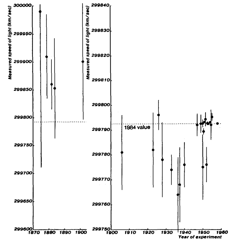
There are interesting patterns in the data. When plotting the expected number of civilisations in the Milky Way based on estimates from different eras the number goes down with time: the community has clearly gradually become more pessimistic. There are some very pessimistic estimates, but even removing them doesn’t change the overall structure.
What are our assumed uncertainties?
A key point in the paper is trying to quantify our uncertainties somewhat rigorously. Here is a quick overview of where I think we are, with the values we used in our synthetic model:
: the star formation rate in the Milky Way per year is fairly well constrained. The actual current uncertainty is likely less than 1 order of magnitude (it can vary over 5 orders of magnitude in other galaxies). In our synthetic model we put this parameter as log-uniform from 1 to 100.
: the fraction of systems with planets is increasingly clear ≈1. We used log-uniform from 0.1 to 1.
: number of Earth-like in systems with planets.
- This ranges from rare earth arguments (
) to >1. We used log-uniform from 0.1 to 1 since recent arguments have shifted away from rare Earths, but we checked that adding it did not change the conclusions much.
- This ranges from rare earth arguments (
- This is very uncertain; see below for our arguments that the uncertainty ranges over perhaps 100 orders of magnitude.
- There is an absolute lower limit due to ergodic repetition:
– in an infinite universe there will eventually be randomly generated copies of Earth and even the entire galaxy (at huge distances from each other). Observer selection effects make using the earliness of life on Earth problematic.
- We used a log-normal rate of abiogenesis that was transformed to a fraction distribution.
- This is very uncertain; see below for our arguments that the uncertainty ranges over perhaps 100 orders of magnitude.
- One could argue there has been 5 billion species so far and only 1 intelligent, so we know
. But one could argue that we should count assemblages of 10 million species, which gives a fraction 1/500 per assemblage. Observer selection effects may be distorting this kind of argument.
- We could have used a log-normal rate of complex life emergence that was transformed to a fraction distribution or a broad log-linear distribution. Since this would have made many graphs hard to interpret we used log-uniform from 0.001 to 1, not because we think this likely but just as a simple illustration (the effect of the full uncertainty is shown in Supplement II).
: Fraction of time when it is communicating.
- Very uncertain; humanity is 0.000615 so far. We used log-uniform from 0.01 to 1.
: Average lifespan of a civilisation.
- Fairly uncertain;
years (upper limit because of the Drake equation applicability: it assumes the galaxy is in a steady state, and if civilisations are long-lived enough they will still be accumulating since the universe is too young.)
- We used log-uniform from 100 to 10,000,000,000.
- Fairly uncertain;
Note that this is to some degree a caricature of current knowledge, rather than an attempt to represent it perfectly. Fortunately our argument and conclusions are pretty insensitive to the details – it is the vast ranges of uncertainty that are doing the heavy lifting.
Abiogenesis
Why do we think the fraction of planets with life parameters could have a huge range?
First, instead of thinking in terms of the fraction of planets having life, consider a rate of life formation in suitable environments: what is the induced probability distribution? The emergence is a physical/chemical transition of some kind of primordial soup, and transition events occur in this medium at some rate per unit volume: 


The uncertainty regarding the length of time when it is possible is at least 3 orders of magnitude (
The uncertainty regarding volumes spans 20+ orders of magnitude – from entire oceans to brine pockets on ice floes.
Uncertainty regarding transition rates can span 100+ orders of magnitude! The reason is that this might involve combinatoric flukes (you need to get a fairly longish sequence of parts into the right sequence to get the right kind of replicator), or that it is like the protein folding problem where Levinthal’s paradox shows that it takes literally astronomical time to get entire oceans of copies of a protein to randomly find the correctly folded position (actual biological proteins “cheat” by being evolved to fold neatly and fast). Even chemical reaction rates span 100 orders of magnitude. On the other hand, spontaneous generation could conceivably be common and fast! So we should conclude that 
Actual abiogenesis will involve several steps. Some are easy, like generating simple organic compounds (plentiful in asteroids, comets and Miller-Urey experiment). Some are likely tough. People often overlook that even how to get proteins and nucleic acids in a watery environment is somewhat of a mystery since these chains tend to hydrolyze; the standard explanation is to look for environments that have a wet-dry cycle allowing complexity to grow. But this means
That we have tremendous uncertainty about abiogenesis does not mean we do not know anything. We know a lot. But at present we have no good scientific reasons to believe we know the rate of life formation per liter-second. That will hopefully change.
Doesn’t creationists argue stuff like this?
There is a fair number of examples of creationists arguing that the origin of life must be super-unlikely and hence we must believe in their particular god.
The problem(s) with this kind of argument is that it presupposes that there is only one planet, and somehow we got a one-in-a-zillion chance on that one. That is pretty unlikely. But the reality is that there is a zillion planets, so even if there is a one-in-a-zillion chance for each of them we should expect to see life somewhere… especially since being a living observer is a precondition for “seeing life”! Observer selection effects really matter.
We are also not arguing that life has to be super-unlikely. In the paper our distribution of life emergence rate actually makes it nearly universal 50% of the time – it includes the possibility that life will spontaneously emerge in any primordial soup puddle left alone for a few minutes. This is a possibility I doubt anybody believes in, but it could be that would-be new life is emerging right under our noses all the time, only to be outcompeted by the advanced life that already exists.
Creationists make a strong claim that they know 
Complex life
Even if you have life, it might not be particularly good at evolving. The reasoning is that it needs to have a genetic encoding system that is both rigid enough to function efficiently and fluid enough to allow evolutionary exploration.
All life on Earth shares almost exactly the same genetic systems, showing that only rare and minor changes have occurred in 

Modern genetics required >1/5 of the age of the universe to evolve intelligence. A genetic system like the one that preceded ours might both be stable over a google cell divisions and evolve more slowly by a factor of 10, and run out the clock. Hence some genetic systems may be incapable of ever evolving intelligence.
This related to a point made by Brandon Carter much earlier, where he pointed out that the timescales of getting life, evolving intelligence and how long biospheres last are independent and could be tremendously different – that life emerged early on Earth may have been a fluke due to the extreme difficulty of also getting intelligence within this narrow interval (on all the more likely worlds there are no observers to notice). If there are more difficult transitions, you get an even stronger observer selection effect.
Evolution goes down branches without looking ahead, and we can imagine that it could have an easier time finding inflexible coding systems (“B life”) unlike our own nice one (“A life”). If the rate of discovering B-life is 


So we have good reasons to think there could be a hundred orders of magnitude uncertainty on the intelligence parameter, even without trying to say something about evolution of nervous systems.
How much can we rule out aliens?
Humanity has not scanned that many stars, so obviously we have checked even a tiny part of the galaxy – and could have missed them even if we looked at the right spot. Still, we can model how this weak data updates our beliefs (see Supplement II).
The strongest argument against aliens is the Tipler-Hart argument that settling the Milky Way, even when you are expanding at low speed, will only take a fraction of its age. And once a civilisation is everywhere it is hard to have it go extinct everywhere – it will tend to persist even if local pieces crash. Since we do not seem to be in a galaxy paved over by an alien supercivilisation we have a very strong argument to assume a low rate of intelligence emergence. Yes, even if if 99% of civilisations stay home or we could be in an alien zoo, you still get a massive update against a really settled galaxy. In our model the probability of less than one civilisation per galaxy went from 52% to 99.6% if one include the basic settlement argument.
The G-hat survey of galaxies, looking for signs of K3 civilisations, did not find any. Again, maybe we missed something or most civilisations don’t want to re-engineer galaxies, but if we assume about half of them want to and have 1% chance of succeeding we get an update from 52% chance of less than one civilisation per galaxy to 66%.
Using models of us looking at about 1,000 stars or that we do not think there is any civilisation within 18 pc gives a milder update, from 52% to 53 and 57% respectively. These just rule out super-densely inhabited scenarios.
So what? What is the use of this?
People like to invent explanations for the Fermi paradox that all would have huge implications for humanity if they were true – maybe we are in a cosmic zoo, maybe there are interstellar killing machines out there, maybe singularity is inevitable, maybe we are the first civilisation ever, maybe intelligence is a passing stage, maybe the aliens are sleeping… But if you are serious about thinking about the future of humanity you want to be rigorous about this. This paper shows that current uncertainties actually force us to be very humble about these possible explanations – we can’t draw strong conclusions from the empty sky yet.
But uncertainty can be reduced! We can learn more, and that will change our knowledge.
From a SETI perspective, this doesn’t say that SETI is unimportant or doomed to failure, but rather that if we ever see even the slightest hint of intelligence out there many parameters will move strongly. Including the all-important
From an astrobiology perspective, we hope we have pointed at some annoyingly uncertain factors and that this paper can get more people to work on reducing the uncertainty. Most astrobiologists we have talked with are aware of the uncertainty but do not see the weird knock-on-effects from it. Especially figuring out how we got our fairly good coding system and what the competing options are seems very promising.
Even if we are not sure we can also update our plans in the light of this. For example, in my tech report about settling the universe fast I pointed out that if one is uncertain about how much competition there might be for the universe one can use one’s probability estimates to decide on the range to aim for.
Uncertainty matters
Perhaps the most useful insight is that uncertainty matters and we should learn to embrace it carefully rather than assume that apparently specific numbers are better.
Perhaps never in the history of science has an equation been devised yielding values differing by eight orders of magnitude. . . . each scientist seems to bring his own prejudices and assumptions to the problem.
– History of Astronomy: An Encyclopedia, ed. by John Lankford, s.v. “SETI,” by Steven J. Dick, p. 458.
When Dick complained about the wide range of results from the Drake equation he likely felt it was too uncertain to give any useful result. But 8 orders of magnitude differences is in this case just a sign of downplaying our uncertainty and overestimating our knowledge! Things gets much better when we look at what we know and don’t know, figuring out the implications from both.
Jill Tarter said the Drake equation was “a wonderful way to organize our ignorance”, which we think is closer to the truth than demanding a single number as an answer.
Ah, but I already knew this!
We have encountered claims that “nobody” really is naive about using the Drake equation. Or at least not any “real” SETI and astrobiology people. Strangely enough people never seem to make this common knowledge visible, and a fair number of papers make very confident statements about “minimum” values for life probabilities that we think are far, far above the actual scientific support.
Sometimes we need to point out the obvious explicitly.
[Edit 2018-06-30: added the GIGO section]
 = p") , then the curve is
, then the curve is  = \exp(-p \lambda t).")
 and is reduced by disasters, then initially some instances will be wiped out, but many realizations achieve takeoff where they grow essentially forever. As the population becomes larger, risk declines as
 .")
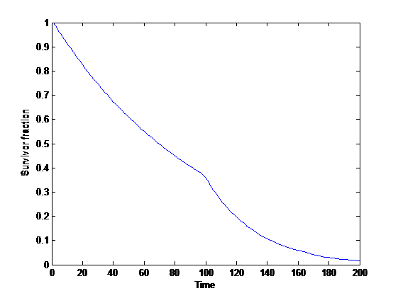
 of time, we get a Weibull distribution of time to extinction, which has a “stretched exponential” survival curve:
 ^k.")
 at a certain time
 }{S(\mathrm{before }t)}=w") . If
. If 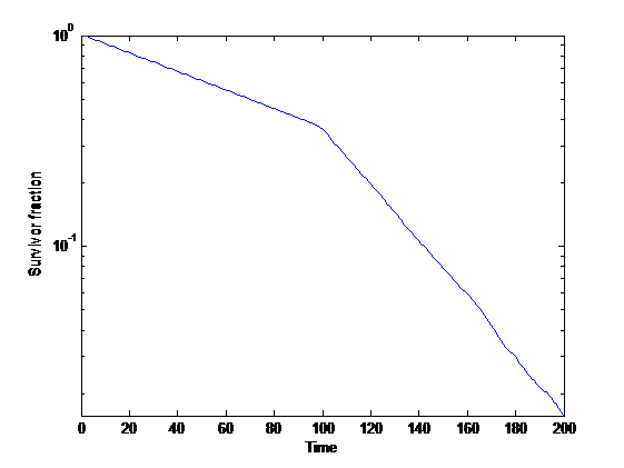
=\Pr(T>t)") where
where  is a random variable denoting the time of death. In engineering it is commonly called reliability function. It is declining over time, and will approach zero unless indefinite survival is possible with a finite probability.
=\frac{d}{dt}(1-S(t))") denotes the rate of death per unit time.
denotes the rate of death per unit time.") is the event rate at time
is the event rate at time  = - S'(t)/S(t)") . Note that unlike the event density function this does not have to decline as the number of survivors gets low: this is the overall force of mortality at a given time.
. Note that unlike the event density function this does not have to decline as the number of survivors gets low: this is the overall force of mortality at a given time. is
is }\int_{t_0}^\infty S(t)dt.") Note that for exponential survival curves (i.e. constant hazard) it remains constant.
Note that for exponential survival curves (i.e. constant hazard) it remains constant. possible scenarios, one of which (
 ) will come about. They have probability
  . We allocate a unit budget of effort to the scenarios:
  . For the scenario that comes about, we get utility
  (diminishing returns).
 .
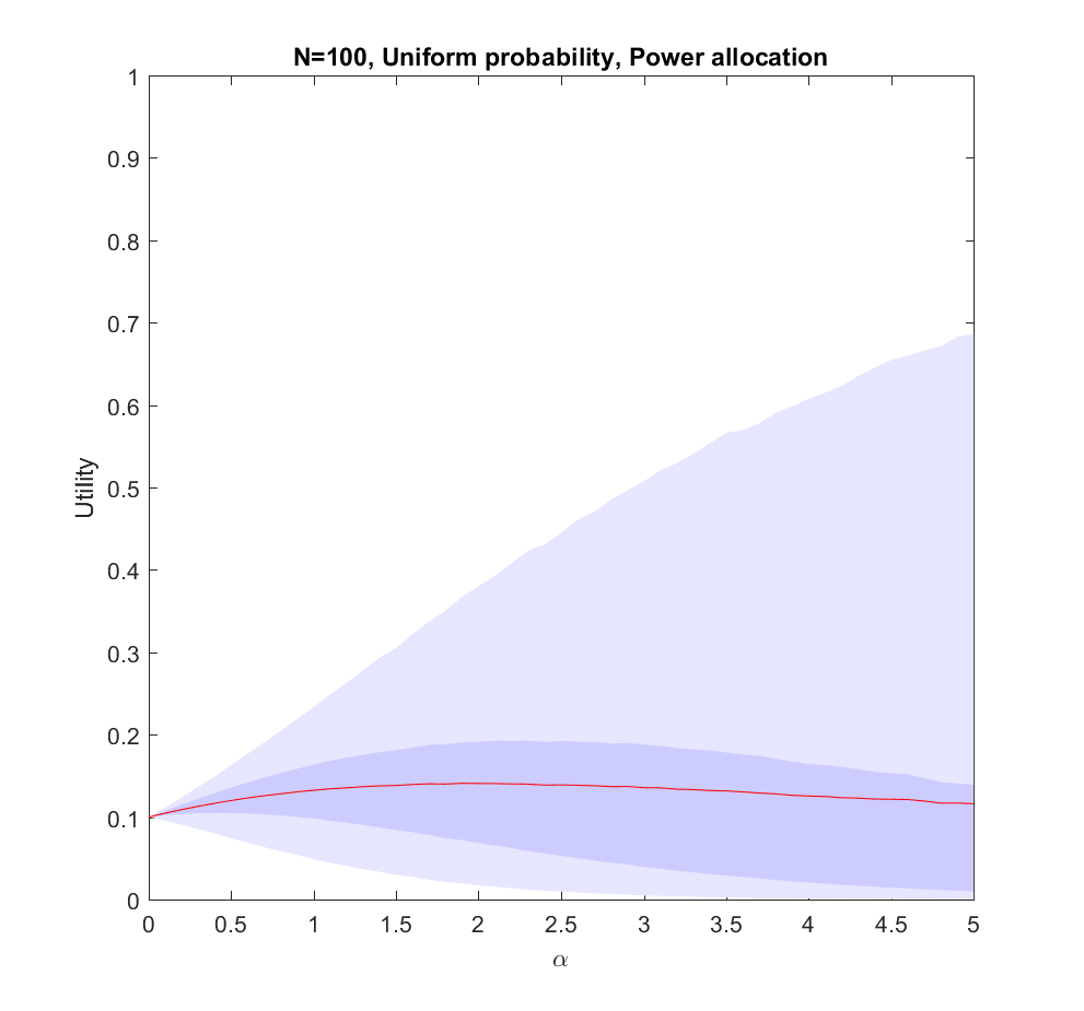
.  corresponds to even allocation, 1 proportional to the likelihood, >1 to favoring the most likely scenarios. In the following I will run Monte Carlo simulations where the probabilities are randomly generated each instantiation. The outer bluish envelope represents the 95% of the outcomes, the inner ranges from the lower to the upper quartile of the utility gained, and the red line is the expected utility.
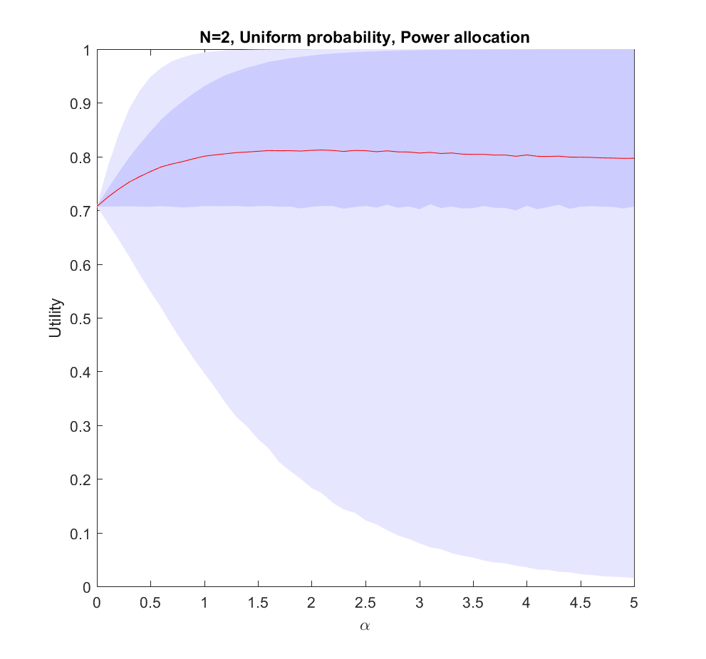
 case: we have two possible scenarios with probability
  and
and  (where
  utility on average, but if we put in more effort on the more likely case we will get up to 0.8 utility. As we focus more and more on the likely case there is a corresponding increase in variance, since we may guess wrong and lose out. But 75% of the time we will do better than if we just allocated evenly. Still, allocating nearly everything to the most likely case means that one does lose out on a bit of hedging, so the expected utility declines slowly for large
  .
.
 case (where the probabilities are allocated based on a flat
  ), but we are not able to allocate perfectly. A more plausible model would give us probability estimates instead of the actual probabilities.
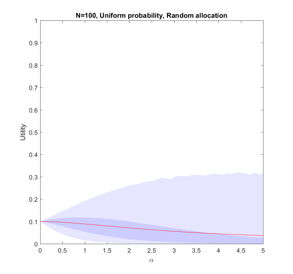
 ). The larger N is, the less likely it is that we focus on the right scenario since we know nothing. The rationality of ignoring irrelevant information is pretty obvious.
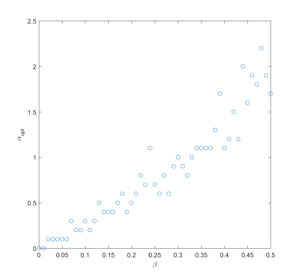
 . In fact, we can mix in just a bit (
 ) of the true probability and get a fairly good guess where to allocate effort (i.e. we allocate effort as
 Q_i)^\alpha") where
where  is uncorrelated noise probabilities). The optimal alpha grows roughly linearly with
  in this case.
 to the different scenarios we get better information about the probabilities, and can now reallocate. A simple model may be that the standard deviation of noise behaves as
  where
where  is the effort placed in exploring the probability of scenario
  . So if we begin by allocating uniformly we will have noise at reallocation of the order of
  . We can set
 =\sqrt{\gamma/N}/C") , where
, where  is some constant denoting how tough it is to get information. Putting this together with the above result we get
 =\sqrt{2\gamma/NC^2}") . After this exploration, now we use the remaining
. After this exploration, now we use the remaining  effort to work on the actual scenarios.
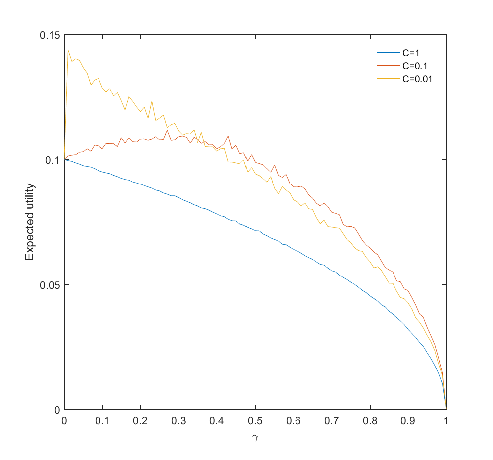
 and the gain is just the utility difference between the uniform case
  , which we know is pretty small. If C is small (i.e. a small amount of effort is enough to figure out the scenario probabilities) there is an optimal nonzero
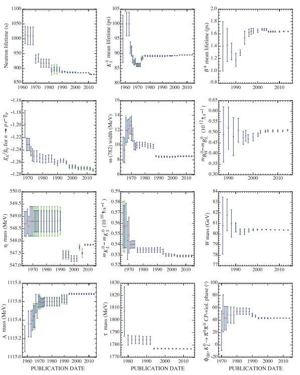
 big surprises (remember that the first data point counts as one!), then the probability of a new surprise for your next data point is
  . So if you expect
  data points in total, when
 /N \ll 1") you can start to trust the estimates… assuming surprises are uncorrelated etc. Which you will not be certain about. The progression towards greater precision may be anything but dull.
you can start to trust the estimates… assuming surprises are uncorrelated etc. Which you will not be certain about. The progression towards greater precision may be anything but dull.

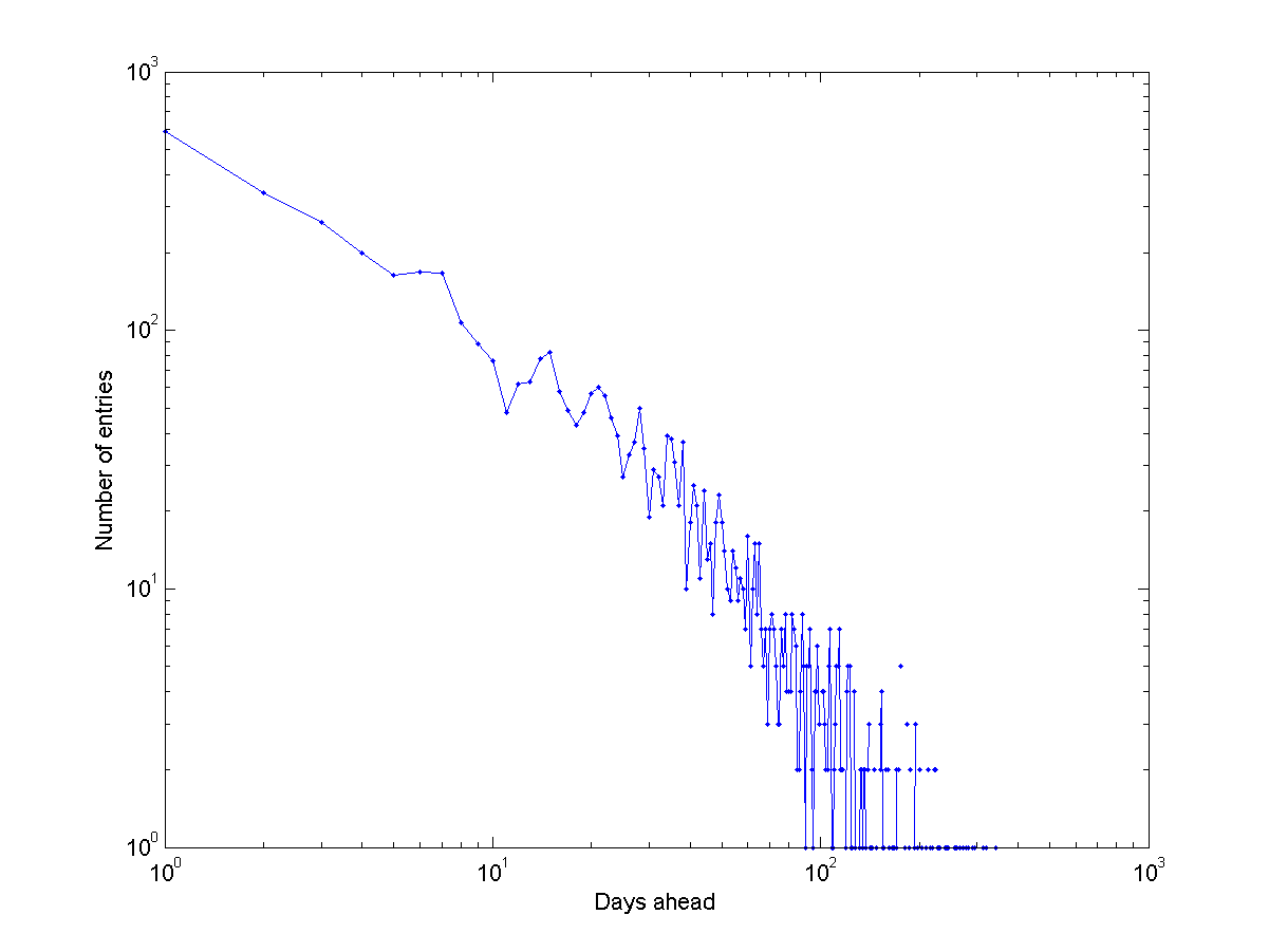
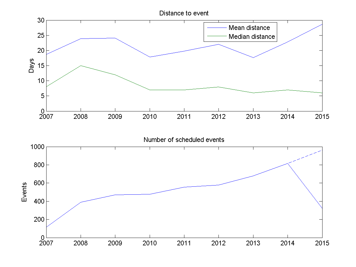

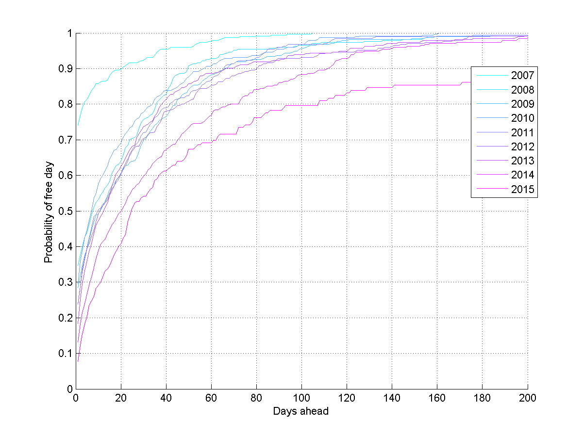
") that a day
that a day ") , then the chance for an empty day is
, then the chance for an empty day is  = \prod_{i=t}^\infty (1-P(i))") . We can estimate
. We can estimate =N(i)/N") .
.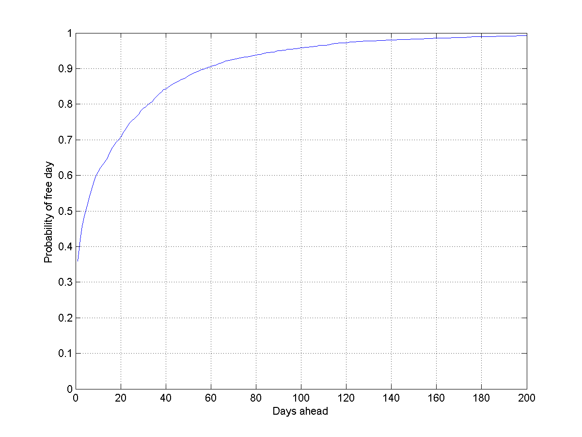
") tells us how often I schedule something
tells us how often I schedule something =N(i)/T") , where
, where  = \prod_{i=t}^\infty e^{-\lambda(i)}") .
.
") and they are are uncorrelated (yeah, right), then
and they are are uncorrelated (yeah, right), then =\prod_{i=t}^\infty e^{-\sum_j\lambda_j(i)}") . The most important lesson is that the chance of everybody being able to make it to any given meeting day declines exponentially with the number of people. If the
. The most important lesson is that the chance of everybody being able to make it to any given meeting day declines exponentially with the number of people. If the